Garment Material
While most digitizers will create an embroidery image that can be edited, it is important to note that different fabric types also determine how an embroidered image will turn out. Generally, the stretchier the fabric is, or looser the weave of material is, the harder it is to embroider. This is due to the amount of support a stitched image needs to keep it from stretching with the material.
Source Image Type & Size
If possible, always provide a higher resolution image than needed in case it needs to be resized. Having to increase the size of a low-resolution image can lead to a lower quality image to work with and will often result in a loss of detail. This is comparable to zooming in on an image, or even taking off your glasses. You will eventually start to see the individual pixels that make up an image, making it look fuzzy and almost out of focus. Check out our blog post about vector and raster images for more information!
Given that the image is not already in the proper .dst file format, it will need to be digitized. Embroidery digitizing is the process of converting the provided image into a stitch file that embroidery machines can read and sew.
During this process, the digitizer must determine a path for the embroidery machine to follow and create the image from start to finish. The digitizer also assigns stitch patterns that will give the best representation of the image, as well as determine which direction these stitches will go.
Avoid Color Gradients When Possible
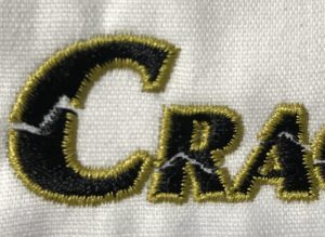
Unlike screen printing, color gradients are more difficult to pull off with embroidery while still maintaining the image quality. If done, these color gradients could look “chunky”. A good example of this can be found on the logo shown below. This is due to solid color threads used to make up an embroidery image. Any images with color gradients will need to be simplified in order to make it possible to produce a high quality embroidered image.
Text Size
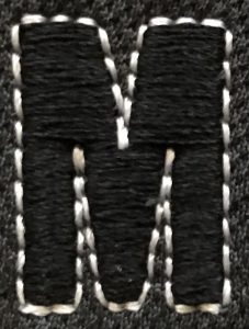
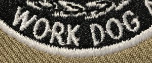
Text needs to be a minimum of ¼” tall in order for it to read clearly once it is embroidered onto the garment. This ¼” height rule applies to even the smaller, lower-case letters and usually translates to an 11pt. font size. The reason for these limitations come down to the size and thickness of both the needle and thread. Both the needle and thread must be held to certain specifications to withstand the embroidery process. This rule is especially important for hats and caps due to the seams on the front panel of the garment. If the text is too small, it may get lost in the seam, causing the quality to diminish.
Font under ¼”
Font meeting ¼” minimum
Fine Details
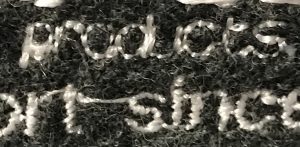
Having finer line work throughout your image may cause some issues. Fine lines are hard to translate into stitches and, if embroidered, will cause a “dotted line” effect (left image) on the garment due to the single thread weaving through the material. To avoid this dotted line effect, also referred to as a run stitch, simply increase the thickness of the line (right image).