Determining the perfect color combination for a screen printing order goes a lot deeper than just finding a few colors that match each other. While this is important and will be expanded upon in this post, colors can and will evoke emotional responses from the audience. In addition, the colors will be one of the first aspects of a custom garment that will catch the audience’s attention, so making sure the color palette you or your customer chooses corresponds with the overall tone of the shirt is of the utmost importance. We have compiled a list of tips to consider when determining the perfect color combination for custom apparel.
Overall Theme of the Garment
Before you begin, it’s important to understand the theme of the apparel you will be creating. First make a note as to why you or your customer are having the apparel made. For example, seasonal event shirts will most likely utilize a different color palette than a shirt being designed for a trade show. Seasonal shirts tend to utilize the colors that are most associated with that time of year, while a shirt designed for a trade show might use colors to target the audience’s emotion and capture their attention.
Seasonal Garments
If your customer is wanting a seasonal garment, it’s very important to understand the colors that are universally associated with it and incorporate them in either the logo or shirt color. While most people have a general idea of the seasonal colors, we have compiled a list for future reference. Here is the list of seasons and the recommended colors to use:

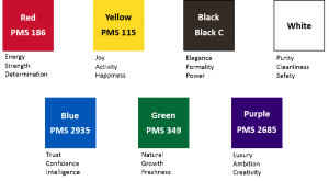
Emotion Connections Involving Colors
Believe it or not, colors can actually evoke emotions in other people. To utilize a color palette to its full potential, you will need to know the overall tone of the piece you are creating, as well as the different colors and their emotional implications. For your reference, here is a list of 8 different colors and the emotions associated with them:
Complimentary Colors
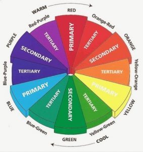
Most people have a general idea of which colors go well together; but fewer people realize that this idea is represented on the color wheel. A color wheel is a great tool that can help determine which colors to use when designing a logo or to just gather some ideas.
Colors that are opposite of one another can be used together to create a crisp look. Use one as your main color and the other as an accent to really make your design stand out.
Another general note to make is that colors located to the left or right of your chosen color are considered complimentary colors. Utilizing these complimentary colors will help your design stay on either the warm or cool side of the color wheel.